Comics
Frank Miller, Superman’s Shlong and Kurt Busiek’s defence of the DKIII minicomic cover
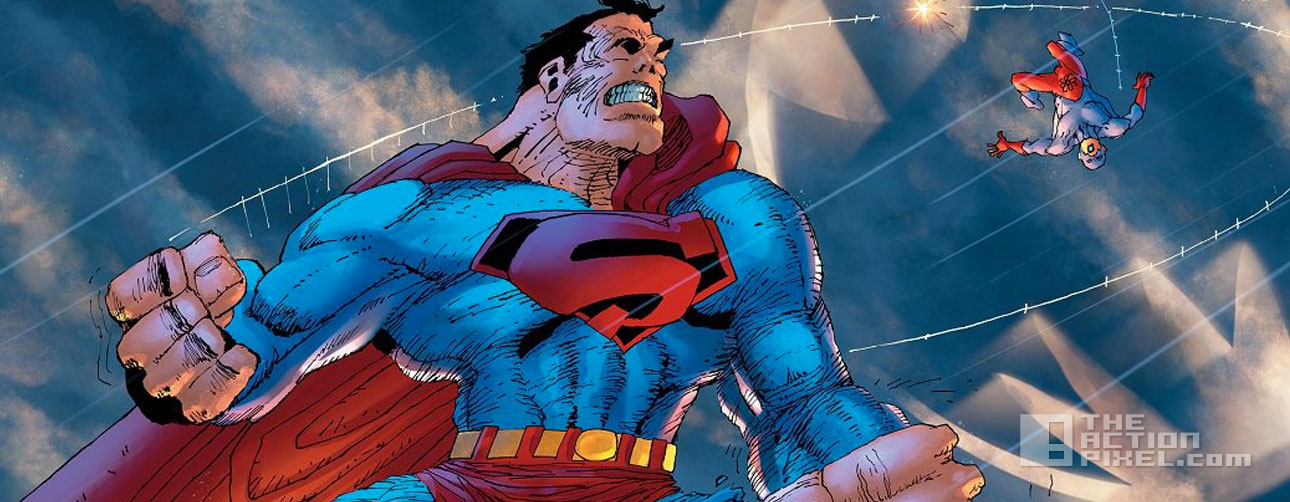
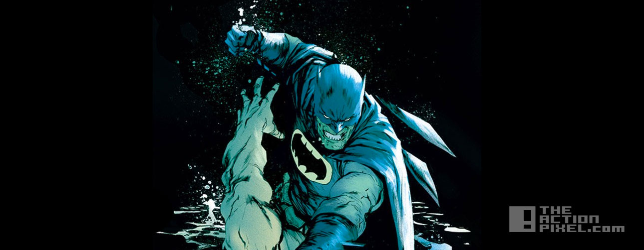
 Frank Miller and DC Comics recently unleashed the render of a wraparound of the 16-page minicomic that will exist in the DKIII. And arguably, Miller’s style has always been ‘loose’, but the release of the cover welcomed a wave of criticism and made the cover the butt of a joke in internet circles. Most notably is the extra effort of Miller to highlight the contours of Superman’s shlong in his shorts. Supe’s packing, apparently.
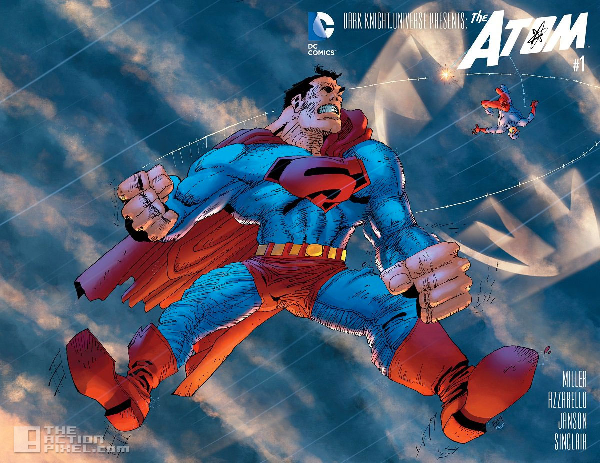 But to Miller’s defence comes in the form of Kurt Busiek, writer of Astro City , to give an alternate interpretation as to why Miller’s render has come out so far left of the typical Superman render in a barrage of tweets, with the gist being Miller wants to do away with the polished refined characteristics people are used to associating with superheroes, particularly Superman:
This shot of Superman says everything Frank Miller wants to establish about Superman in this world. pic.twitter.com/XXJGbBtqsD
— Kurt Busiek (@KurtBusiek) October 5, 2015
People who like a sleek, realistically-rendered Superman—the Superman they’re used to—will hate it.
— Kurt Busiek (@KurtBusiek) October 5, 2015
But Miller’s not interested in presenting more of that Superman.
— Kurt Busiek (@KurtBusiek) October 5, 2015
He’s been talking for years about the crude power of superheroes, how they had more impact in the Golden Age when they were raw, unpolished.
— Kurt Busiek (@KurtBusiek) October 5, 2015
People will talk about how Frank’s not drawing it well, or not drawing it right, but that’s not what’s going on.
— Kurt Busiek (@KurtBusiek) October 5, 2015
Frank’s drawing it the way he wants the idea of this raw, crude, powerful idea to come across, not the way Neal or Curt or anyone else drew.
— Kurt Busiek (@KurtBusiek) October 5, 2015
He’s powerful, ugly, Eastwood-mad, with Kirby fists and a noticeable dick. This isn’t by mistake, it’s not lack of control.
— Kurt Busiek (@KurtBusiek) October 5, 2015
It’s cartooning, it’s Frank presenting an idea of Superman that isn’t sleek and pretty.
— Kurt Busiek (@KurtBusiek) October 5, 2015
I expect a lot of people are going to hate it. I’m not saying you should like it.
— Kurt Busiek (@KurtBusiek) October 5, 2015
I’m saying it’s not the result of someone “losing it.” It’s the result of Frank wanting to say something different, that you don’t like.
— Kurt Busiek (@KurtBusiek) October 5, 2015
It’s not failure. It’s successfully saying something that you didn’t want him to say. But he wanted to, so he did.
— Kurt Busiek (@KurtBusiek) October 5, 2015
Again, doesn’t mean you should like it. Lots of art, lots of opinions about it, that’s fine. But it’s on purpose, not lazy, not an attempt..
— Kurt Busiek (@KurtBusiek) October 5, 2015
…to draw like Neal and failing. This is specific, it’s what he’s trying to say.
— Kurt Busiek (@KurtBusiek) October 5, 2015
Dark Knight 3: The Master Race first issue is out November 25th 2015
“So what do you guys think? Has Miller fallen off the deep end artistically? Or is this render a carefully executed pretext to what to expect come DKIII and the Superman of this particular DC universe? Let us know in the comment section below”